

Symbols, fixes and glitches | Generative art diary
Improving things I hacked together last time

I write about generative art, code, creativity and other interconnected topics. You can expect a diary on Fridays sharing the art I’ve been working on. Thanks for joining me here. 💖
Hello!
Making art for me has always been about the audience. I love the process as well but the thing that drives me is when other people enjoy the things I’ve made. Actually, I wrote an article a few years ago about how pretty much all I want in life is to make things and then have other people look at those things and be like "woah, cool.”
This means I’m particularly drawn to sharing things online. To build my audience yes, but also simply to get the feeling that someone else has looked at and enjoyed something I made. As social media continues its descent into hell, finding a platform for this is harder. It’s really bad that one of the best places you can go to show people your art is also the place you can go to read the worst opinions in the world.
Obviously it’s always had its problems, but I miss when it felt like there was community and opportunity in social media. That’s why I created this newsletter to begin with, and it’s why I’m committed to it, now that I’m settled in my new studio. I hope you like looking at the stuff I’ve made.
Things I’ve done recently
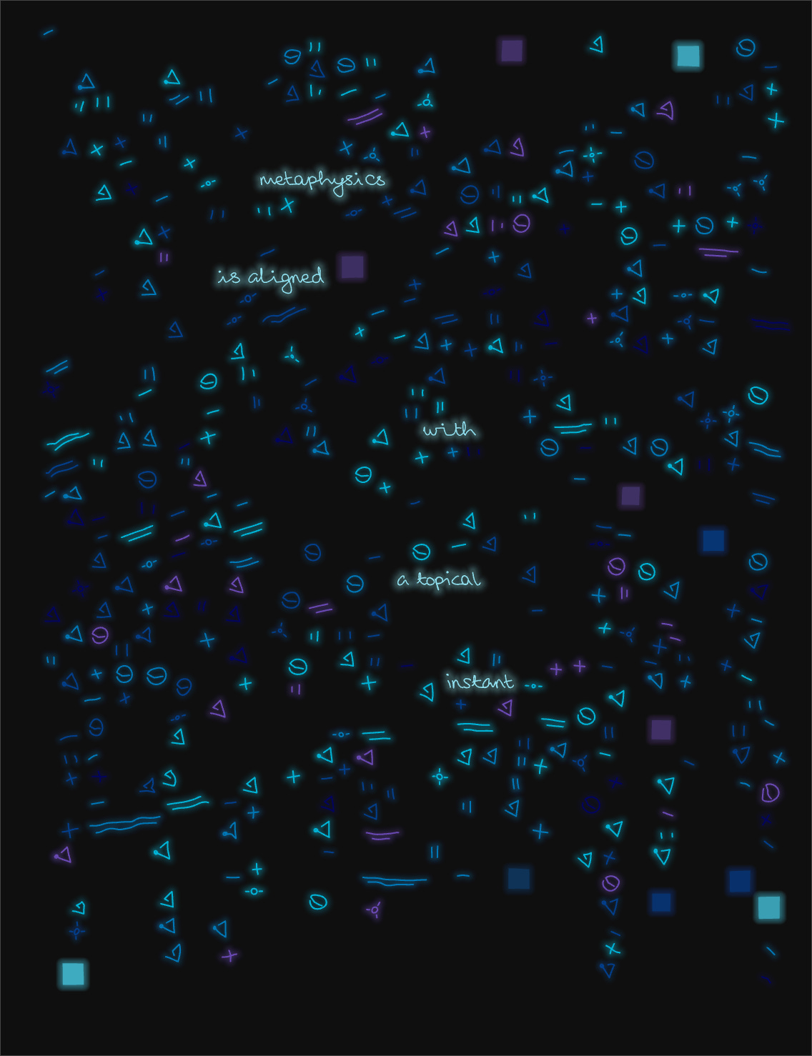
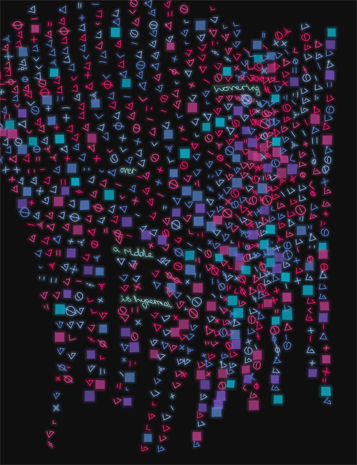
I’ve been working on these symbolic grids.

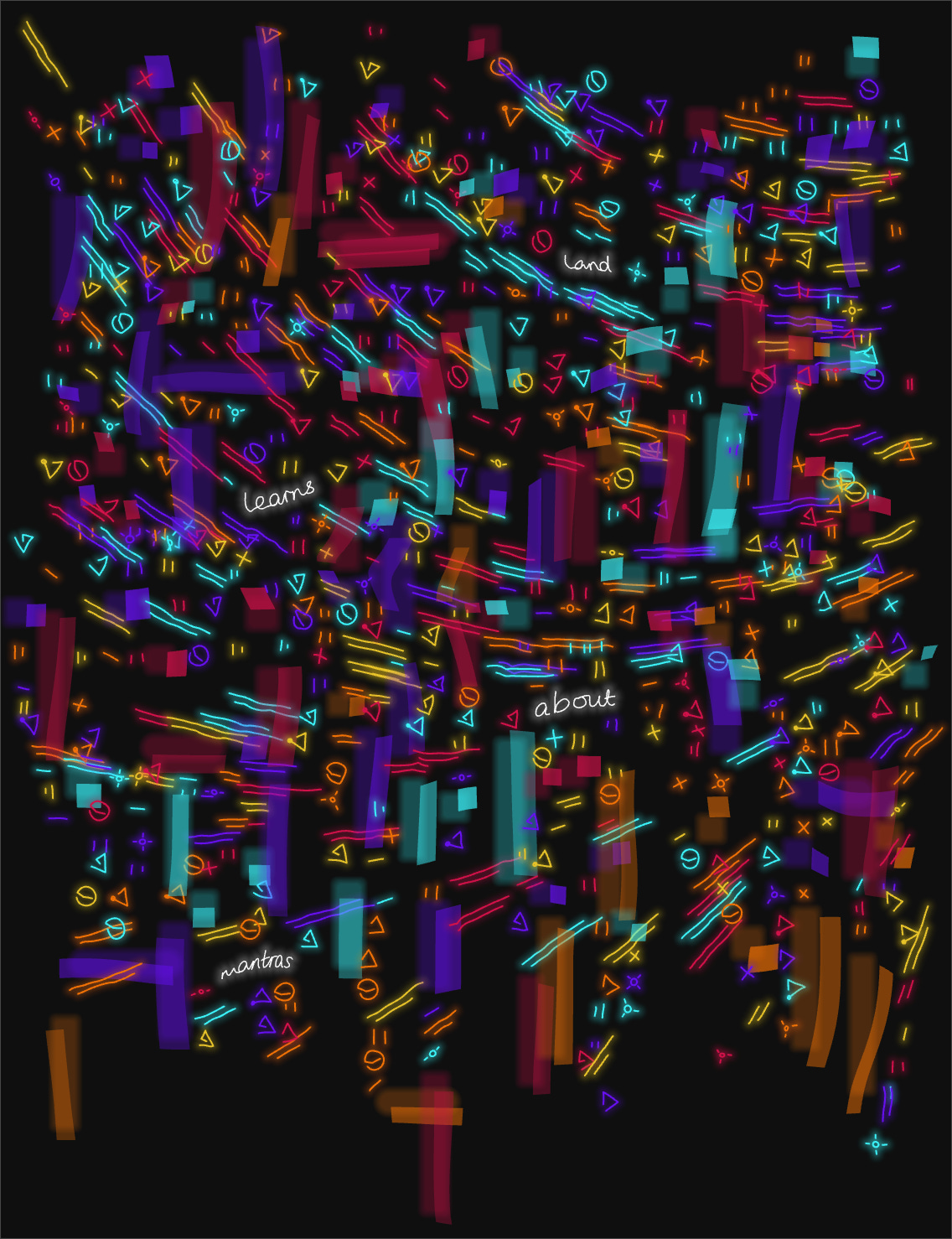
I’ve done a lot of fixes and improvements so I have some behind the scenes, debug views and close ups to share with you.
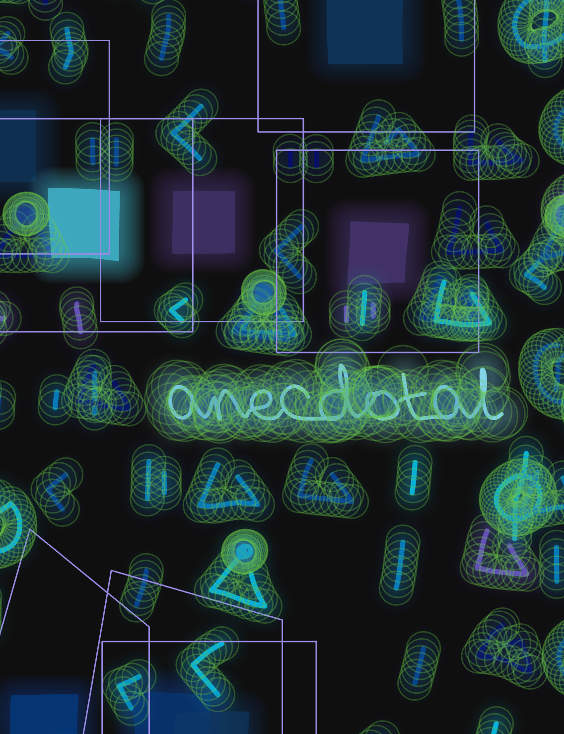
Glow
Previously I was achieving a glow by using the filter(BLUR, x) function from p5js but this was temporary. It’s slow and it doesn’t allow a lot of control.
Now, the glow is achieved by redrawing the path or shape multiple times, larger than the original, and in decreasing opacity. Close up, it looks like this:

Here’s another version where I’ve reduced the number of repeats that are drawn, and increased the opacity on each one, so you can get more of a sense of what’s going on.

Collisions
This is another situation where I hastily coded something to get an idea of how it would look, and this week I’ve come back to improve it. In these early outputs, if you look at the area immediately around the words, there is a hard cut off on the symbols surrounding the text. That’s because I was clearing space for the words simply by drawing a background colour rectangle over the symbols.


To fix this, I’ve now implemented the same collision manager that I use in my diagram project. Text is given a higher priority than the symbols and, whenever they collide, the symbol is dealt with.
Initially this just meant the symbol was invalidated and not drawn. That produces results like this.

The empty space around the words is still really blocky. The symbols are placed in a grid and, when they are removed, blocky sections are blank.
To deal with this, I added a new feature into my collision manager. Items now have a setting called “movable”. If a colliding object has this setting on then it will move away from the thing it collided with, in small steps, until it no longer collides.
Here are the results:

The collision manager has a few different ways it can detect collision. A collision item can have any number of:
a bounding box
points (with a radius)
a path2D
lines (although tbh I rarely use this)
Each object is compared and it checks things like whether one object’s points are too close to another’s, whether its points are inside the path, whether the lines intersect or if the points are too close to the lines.
In this close up I have the debug view turned on so you can see:
collision points along the symbol paths, draw in green.
path2D’s around the squares, drawn in lilac.
In this image, the radii of some of the points on the word “anecdotal” are straying into the path2D of the square above but when comparing a path and a point, the centre of the point has to be inside the path to count as a collision. That’s why the paths are so much bigger than the actual squares, to create that distance from the other side.
You might notice that lots of the symbols collide with each other! This is because collision objects have a property called collisionOKFriends - an array of objects that it’s okay to collide with, because they’re friends. Each symbol has all the other symbols in that array and collisions between them are ignored.
It’s easy to turn this setting off and deal with symbols that collide with each other as well.
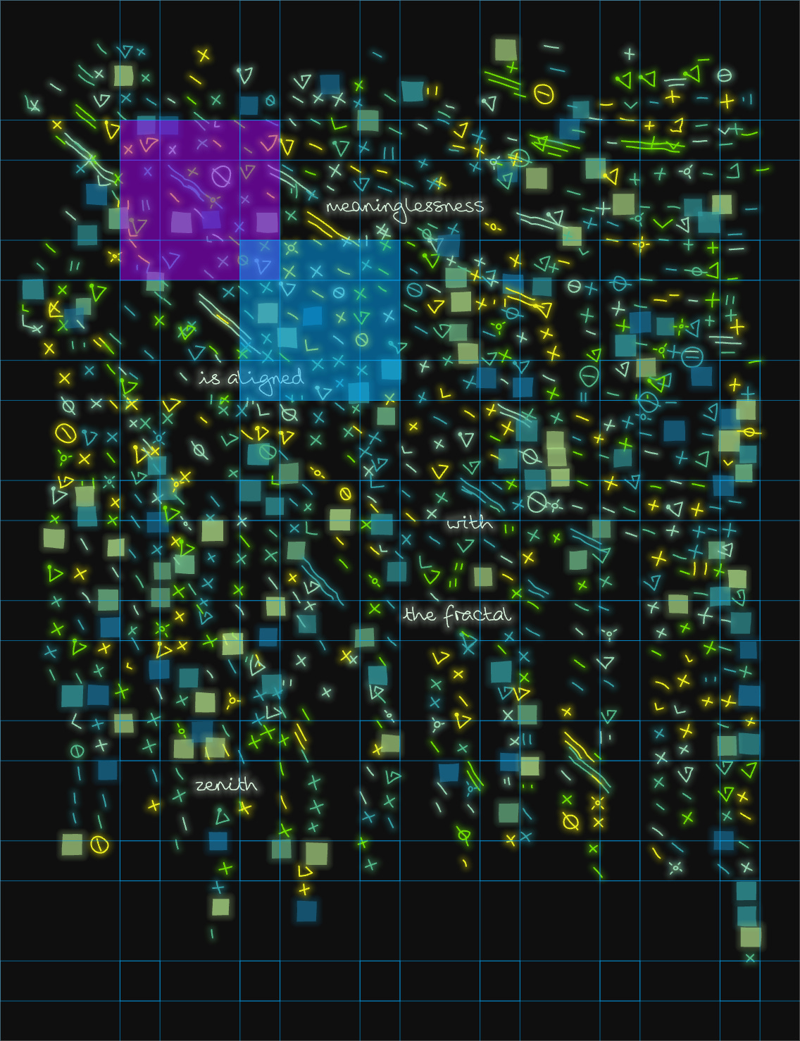
Sometimes there are lots and lots of symbols, which meant that the collision checker was pretty slow.
I improved efficiency by splitting the canvas into segments, putting all the elements into these segments, and then only making comparisons on elements that are in the same segment.
Here you can see the segment grid. Each segment overlaps the ones next to it, two of them are highlighted.
Experiments and features
Now that I have those things figured out, I’ve been experimenting with ideas and features.
Like shifting positions in a Noise field…

extending the squares into blocks…

and glitchy repeats…


FUN.
Lots of experimenting and ideas to go here still. I’ll keep you posted.
That’s all, thanks again for joining me!
I’ll leave you with this rainbow hitting my bookshelf, and I’ll see you here next week.
- Amy ⭐

These grids definitely make me think “whoa, cool”!
I’m not a coder enough to fully understand all of this, but I was reading this article this morning and it made me think about your notes on rendering your improved blur as well.
https://rive.app/blog/how-rive-reinvented-feathering-for-the-vectorian-era